

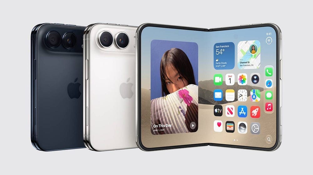
I watched the entire iPhone Duo keynote with genuine excitement. The animation was gorgeous. The magnetic snap when you close it made a sound that probably cost a team of acoustic engineers six months to perfect. This multitasking looked fluid: tent mode, selfie mode, half-fold keyboard-all of it felt desirable and polished and deeply, unmistakably Apple.
Afterwards, I realised something unspoken by any presenter, which changed my entire view of the product.
Every single video shown during the keynote was displayed in full screen.
No black bars.
No cropping.
No letterboxing.
Every TikTok, every film clip, every piece of content fit the Duo’s 4:3 inner display perfectly, edge to edge, as if the aspect ratio problem that plagues every passport-format foldable didn’t exist.
Except it exists. Apple just chose not to talk about it.
The Problem Apple Named and Then Ignored
Here’s what makes this particularly frustrating. Apple didn’t just avoid the issue. They actively highlighted it at the beginning of the keynote as something they’d solved.
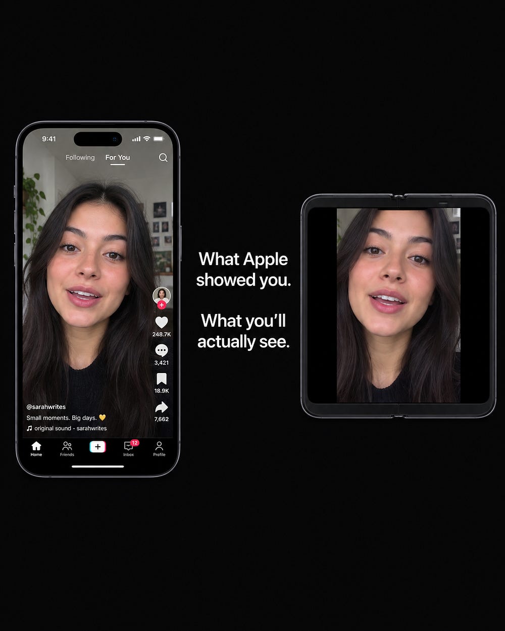
The opening segment showed what happens when you take two standard vertical smartphone screens and stick them together: you get a square. And on a square screen, 16:9 horizontal video produces enormous black bars. 9:16 vertical video produces enormous black bars in the other direction. Apple showed these examples on stage. They made the case convincingly that the traditional fold format (two tall, narrow screens joined at the spine) creates a viewing experience that’s worse than a regular phone.

Then they introduced the passport format. Wider, squarer, more balanced. A 4:3 aspect ratio when unfolded. And they implied, through the structure of the presentation, that this format resolved the content display problem.
It didn’t. They just stopped talking about it.
A 16:9 horizontal video displayed on a 4:3 screen without cropping uses approximately 75% of the available display area. The remaining 25% is black bars at the top and bottom. A 9:16 vertical video on the same screen in portrait mode fills roughly 75% of the 3:4 canvas. The remaining 25% is black bars, left and right.
Apple’s solution during the keynote was simple: crop everything to fill the screen and show only content that looks good at 4:3.
No black bars are visible.
No aspect ratio mismatch is visible.
No problem visible.
But if you’ve ever watched a vertical TikTok that was cropped to fit a different aspect ratio, you know exactly what happens. The top of someone’s head gets cut off. Or the bottom of the frame disappears. Subtitles become oversized. Using two vertically stacked cameras to record a podcast results in losing the forehead of the upper person and the chin of the lower person. The content was framed for 9:16. Forcing it into 4:3 means losing roughly 25% of the image, and it’s always the 25% you actually needed.
This Is 90% of How People Use Their Phones.
Here’s why this isn’t a nitpick.
Vertical content has become the dominant format of mobile media consumption. TikTok, Instagram Reels, YouTube Shorts, LinkedIn video posts, Snapchat stories. These platforms succeeded specifically because their content fills the entire screen of a standard smartphone. The immersive quality of full-screen vertical video comes from the absence of any competing elements for your attention.
No UI elements peeking in from the edges.
No black bars reminding you that you’re looking at a screen. Just content, edge to edge, pulling you into the scroll.
On the iPhone Duo’s 4:3 inner display, that immersion breaks. Either you accept black bars (which feels like watching a movie on a screen that’s the wrong shape) or you accept cropping (which loses content the creator intended you to see). Neither option preserves the experience these platforms were designed to deliver.
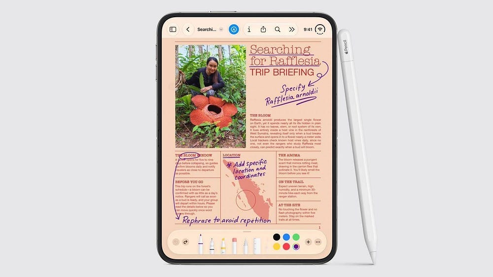
Apple knows this. The iPhone Duo’s outer display is also 4:3 in a 3:4 orientation when held vertically, meaning the same problem applies whether the phone is open or closed. You’re watching vertical content on a display that is the wrong shape for vertical content, in every configuration the device offers.
